Posts

Somewhere

Image
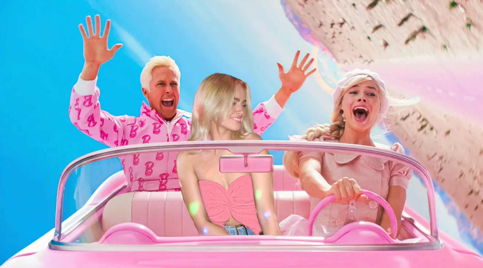
     In this Photoshop creation, I blended reality with fantasy. I put myself into a scene from the iconic new 2023 Barbie movie, I carefully cropped my image to merge with the vibrant surroundings. The incorporation of the signature pink themes became the heartbeat of the composition, infusing the piece with the charm of the Barbie universe. Meticulously crafting the interplay of light and shadows, I endeavored to achieve a harmonious integration, allowing myself to organically inhabit the fantastical landscapes. Through this work, I wanted to explore the power of imagination and challenge the conventional boundaries of self-expression. This work serves as a visual celebration of the fluidity of identity, inviting viewers to witness the magic that unfolds when one daringly steps into the captivating world of Barbie.
Tagbrush

Image
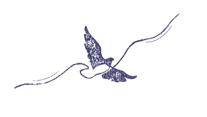
       As you can see, I have included both my original black and white logo design, with my new currated design. This logo means a a lot to me as I feel it symbolizes myself being free and not staying in one place at one time. I felt that it embodied what I feel on a daily basis, as I am always looking to expand and grow in different places. I was able to create my tag brush from my logo in Adobe Photoshop. I used stamping tool and presets that were almost like graffiti art inspired. I chose the royal blue color because I feel it jumps off the page, and has a regal feel to it.      

Postcard

Image
This is a New York City postcard I created in Adobe InDesign. The inspiration around this creation was light pastel colors, giving it a cartoonish, urban theme. I found that the font of the header matched the soft lines and curves of the background image, and wasn't too harsh and jumped off the page. All the colors on the front and the back stayed within the same color family.  I drew my inspiration from New York Cities skyline, yet instead of it being black and grey, I wanted to spice is up and make it look warm and inviting. I used templates I found online for the card creation, and added my personal logo to each side.   

Business Cards

Image
Artist Statement    These business cards attached here are pieces I created in Adobe Indesign. All three cards (front and back) incorporate my full name, example information, and most importantly my logo. The overall vision of my these works were that I wanted to do something simple and soft. I wanted to stay away from sharp lines and harsh angles, and make it lighter and more fun. I used pastel colors to contrast the dark primary colors of the logos.       I imagine these cards would be for a personal small business of mine. Using InDesign I ran into a few trials and error. I used my skills to create simplistic work, while keeping in mind things like correct formatting, bleed, and page layout. The colors reflect a pastel color palette which is easy on the eyes. That was a key component of my work, I wanted it to be inviting and warm with its layout and decorative elements.   

InDesign Homework 1

1. InDesign for Beginners https://www.youtube.com/watch?v=RXRT3dHu6_o  This video dives into many elements that beginners using Indesign can benefit from. The man in the video shows steps like creating text boxes, aligning margins, and he shows a lot of shortcuts also. The man in the video Dan, shows how to make spreads versus single pages. Spreads can be used to make multiple pages like magazines and pamphlets. He shows how to make the multiple pages, have the same elements by using tools like the layers and copy and pasting. He talks a lot in his videos about "bleeding" which can happen when elements are off the margins of the page which can tend to happen with a lot of text.  2.  Learn Adobe InDesign in 11 MINUTES! | Formatting, Tools, Layout, Text Etc.  https://www.youtube.com/watch?v=wF_fu1wcT0Y This video explains how to import and export images and elements in InDesign. It also explains master pages.  When you have a multiple-page document, such as a brochure or catalo

Animated GIF

Image
 November 28, 2023     Included below is the piece I created for my animation assignment. I created it in photoshop, and it is a GIF of a turtle swimming around and then finding some aquatic plants to eat, and then the turtle moving on. I was inspired by children s book animations, and Youtube kids videos. I felt the colors were very bright and cheerful that children can appriciate and be attentive to. 

Photoshop HW 3

Image
  I feel this image would be really hard to photoshop myself into. The lightening and filters of this image would make it hard to match up with a separate edited photo of me.  This image gave me some inspiration for the upcoming Somewhere project. As I was looking through this mans Instagram, he does a lot of cool shots with Photoshop and celebrity images. In this picture, I saw Margot Robbie, and I had the idea of adding myself in a Barbie movie scene.  These images make a laugh because the author of them has people message and request Photoshop details. He then alters them in a funny way but also on par with what the individual asked for, but in a different way. These photos made me laugh because someone asked him to make the boys dad a little shorter, so the author made the dads whole torso smaller in a funny way.  I liked the illusion of these images. The use of shadows and light to reflect onto the girls face is a great way to naturally create illusions by using organic materials